Weltix
Weltix was born as a new player in digital wealth management, with a clear goal: making financial strategy more human, simple, and accessible.
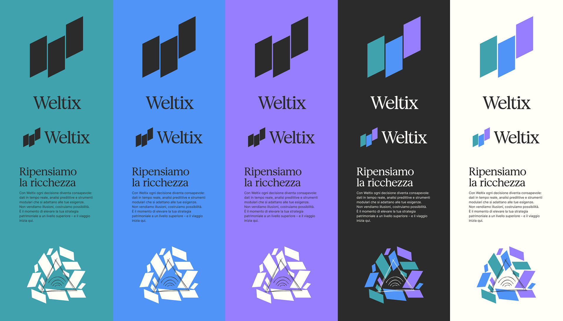
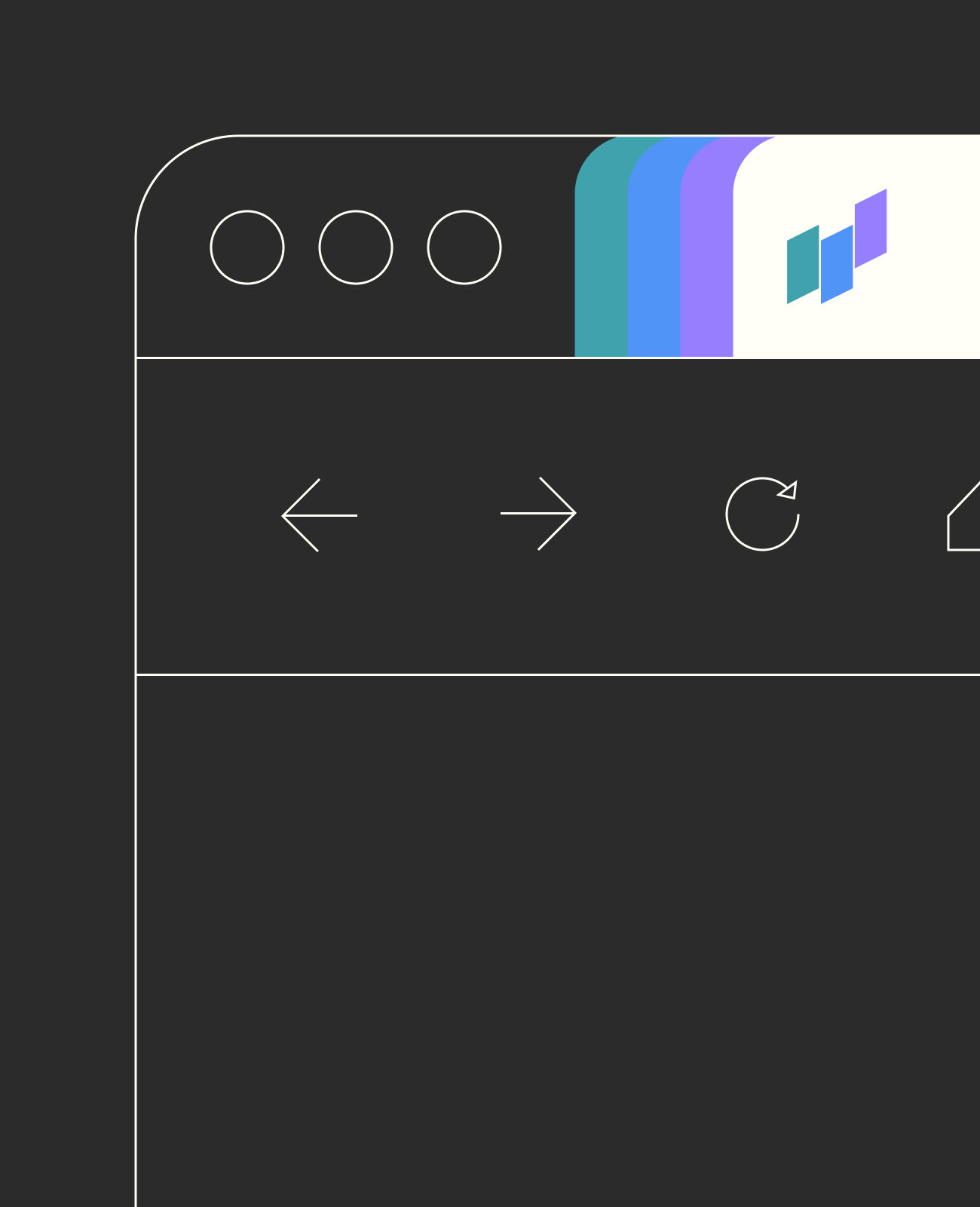
The brand originates from the convergence of three distinct realities, symbolized by three ascending geometric forms that look toward the future. The result is an identity that blends precision and warmth, technological rigor and human sensitivity — a balance designed to inspire trust while embracing modernity.
The brand originates from the convergence of three distinct realities, symbolized by three ascending geometric forms that look toward the future. The result is an identity that blends precision and warmth, technological rigor and human sensitivity — a balance designed to inspire trust while embracing modernity.
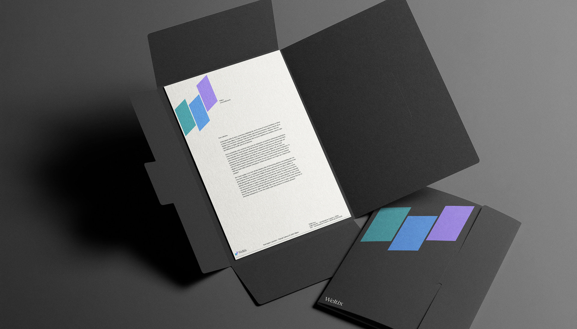
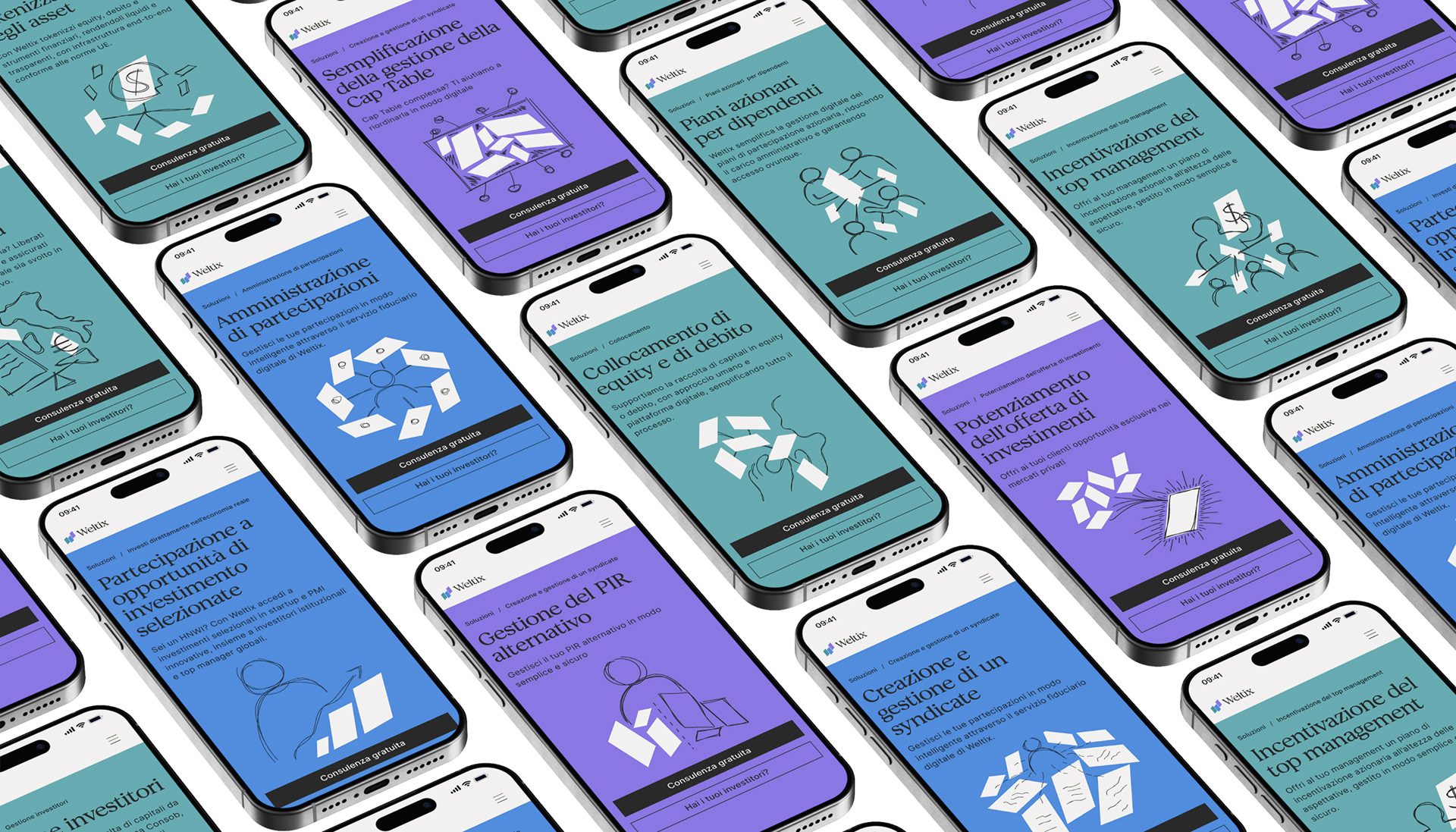
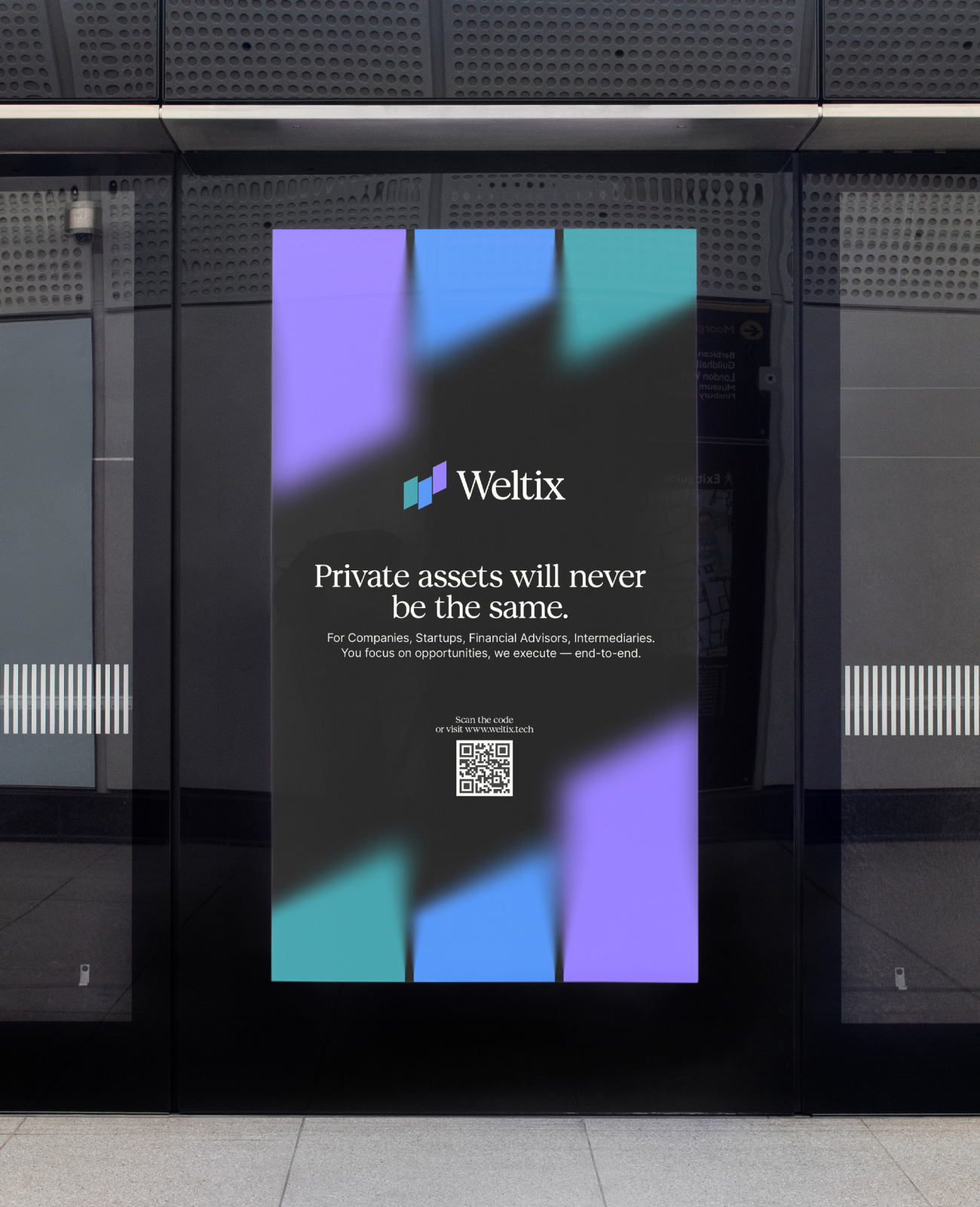
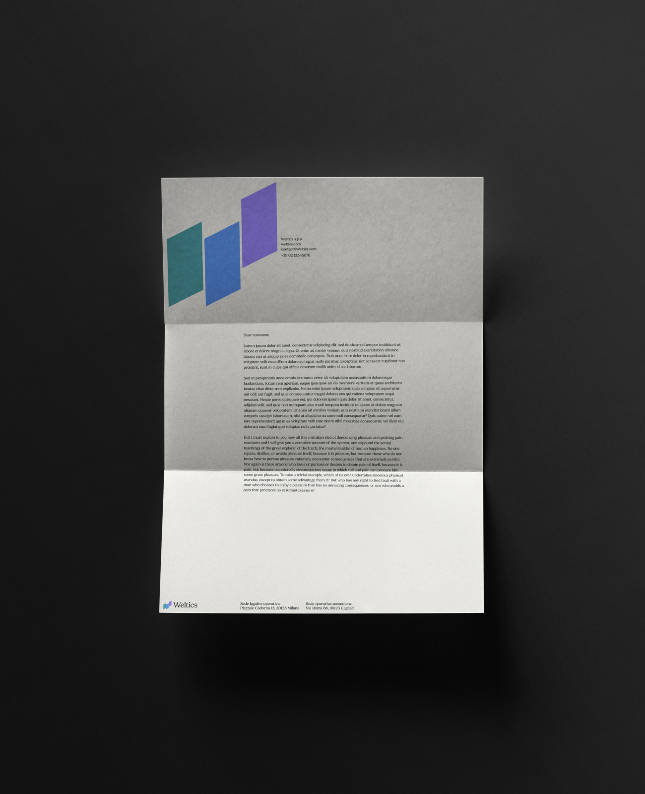
The visual identity of Weltix revolves around a refined yet distinctive palette: vibrant digital hues of teal, blue, and violet blend with deep graphite and soft cream, expressing the dual nature of the brand — human and technological.
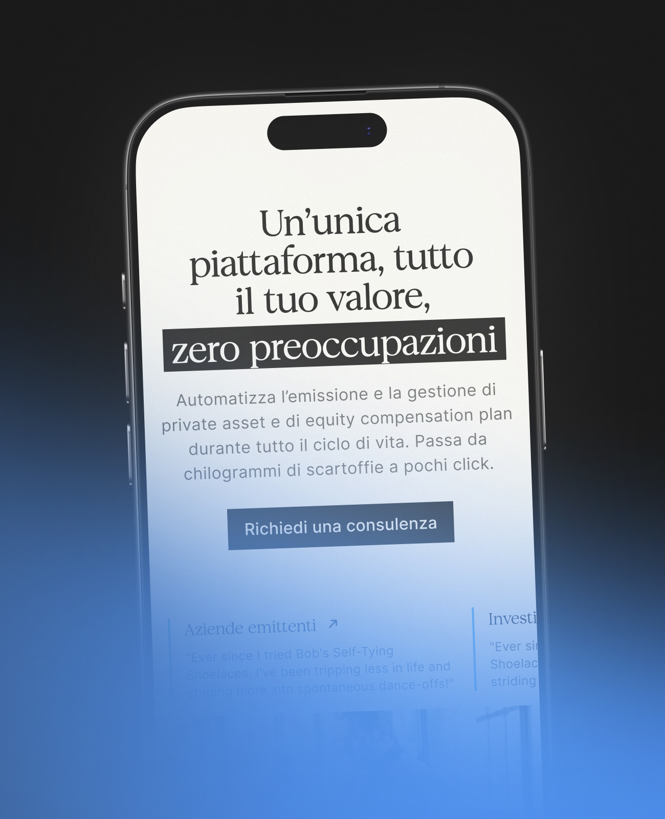
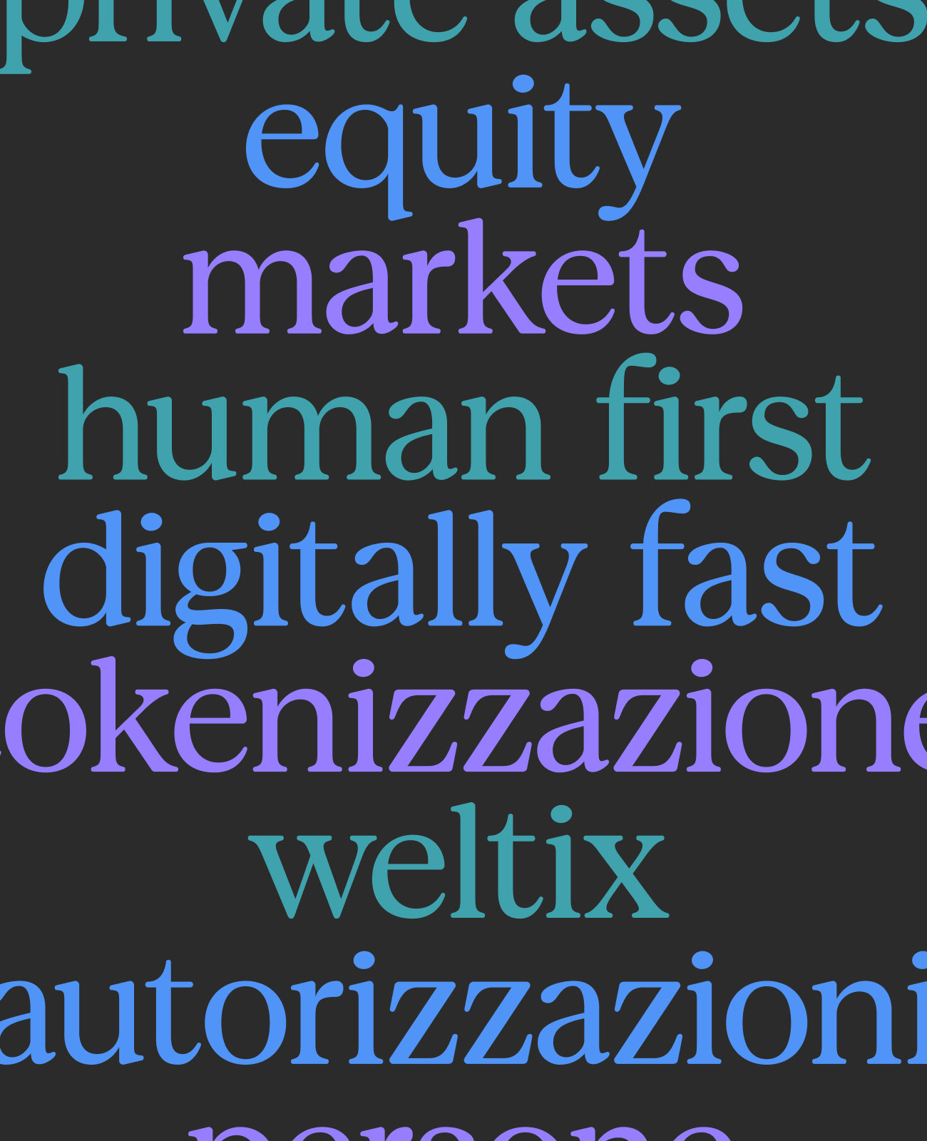
The typography combines classical proportions with modern details, striking a balance between authority and approachability.
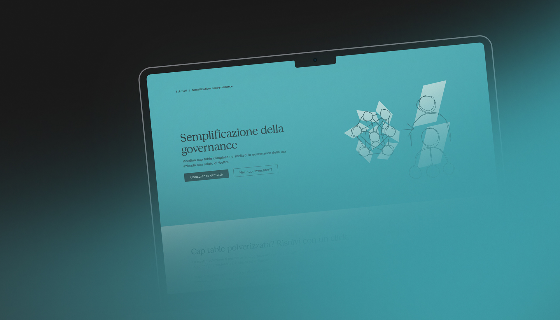
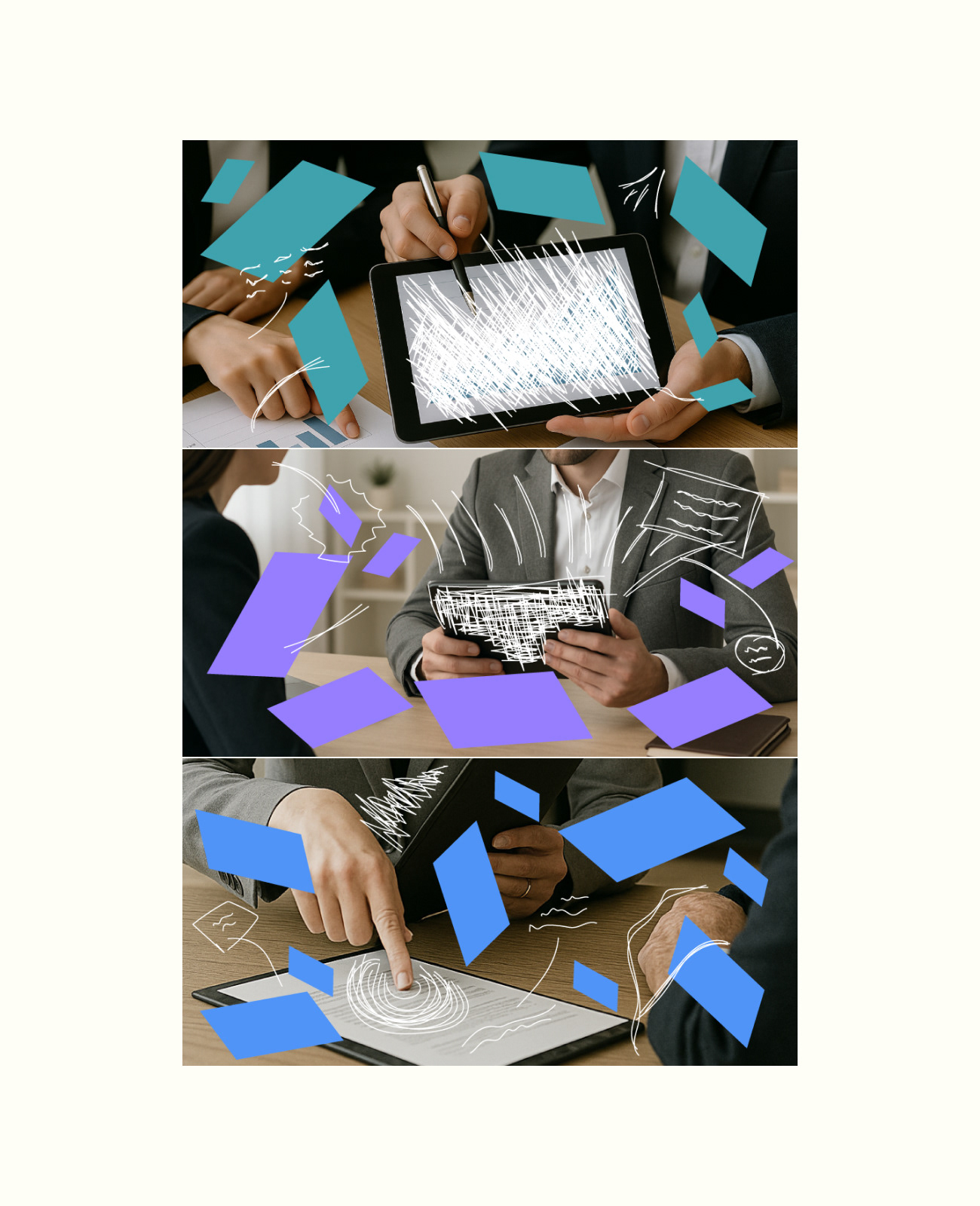
Line illustrations, drawn with irregular and expressive strokes, add an empathetic and “human-friendly” layer to the system, making the world of finance feel closer and more understandable.
The typography combines classical proportions with modern details, striking a balance between authority and approachability.
Line illustrations, drawn with irregular and expressive strokes, add an empathetic and “human-friendly” layer to the system, making the world of finance feel closer and more understandable.
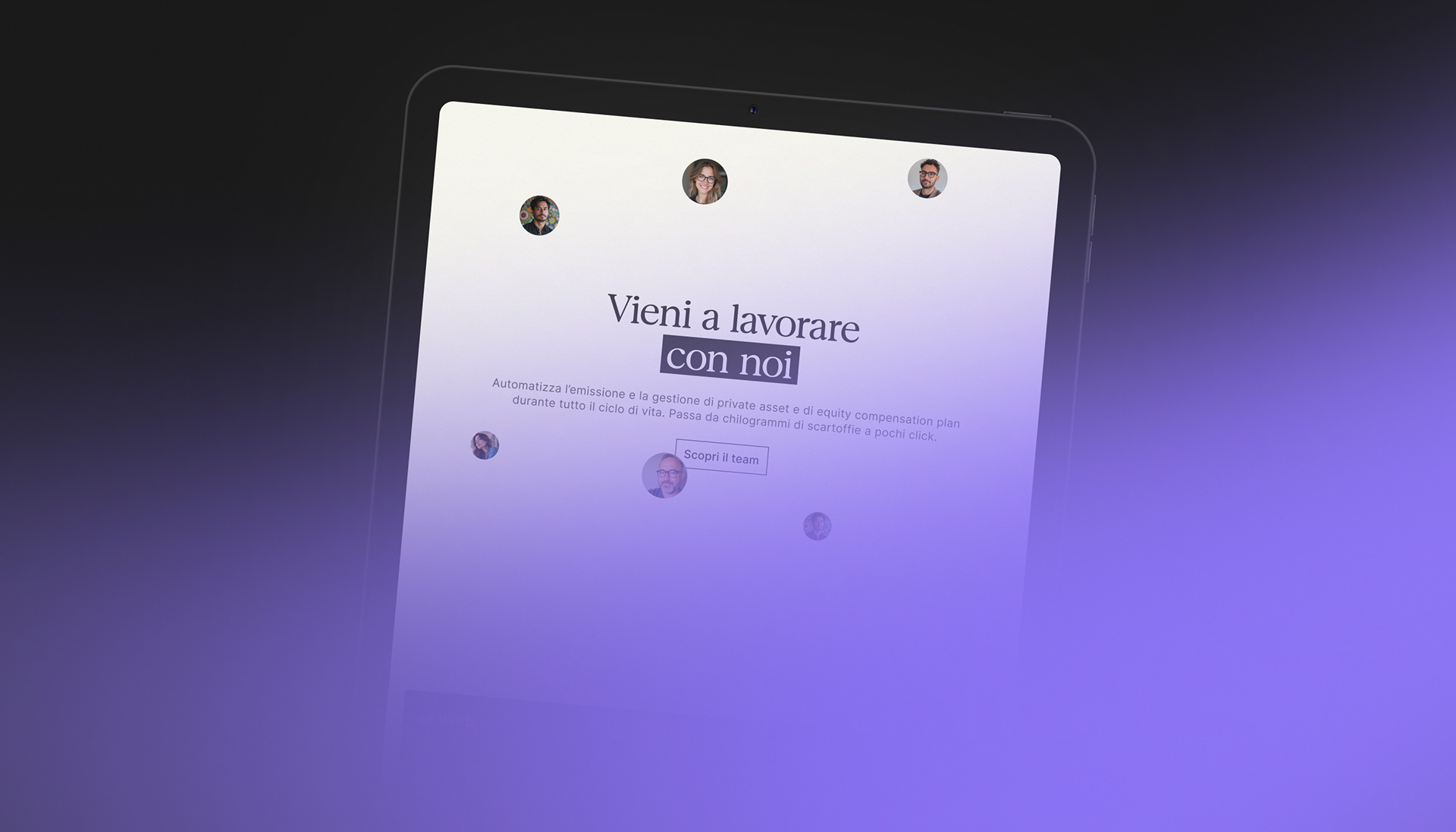
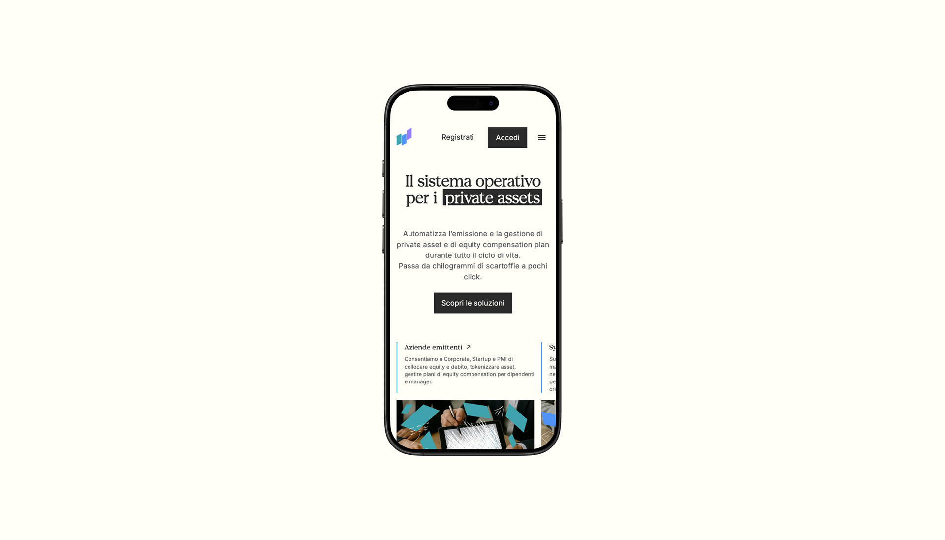
On the digital side, the UI design mirrors the modularity of the brand system: open layouts, clear visual hierarchies, and a precise use of color guide users through an intuitive and seamless experience.
Weltix communicates its positioning with consistency and clarity: “Human first, digitally fast.”
Weltix communicates its positioning with consistency and clarity: “Human first, digitally fast.”
Client / Weltix S.p.A
Agency / The Wave
Team
Design Director: Simone Guccio
Graphic Design: Mattia Zingale, Simone Saporita
UI/UX: Simone Saporita, Leonardo Maltese
Motion Design: Stefano Ardemagni, Leonardo Maltese
Go to Website: https://weltix.tech
Design Director: Simone Guccio
Graphic Design: Mattia Zingale, Simone Saporita
UI/UX: Simone Saporita, Leonardo Maltese
Motion Design: Stefano Ardemagni, Leonardo Maltese
Go to Website: https://weltix.tech